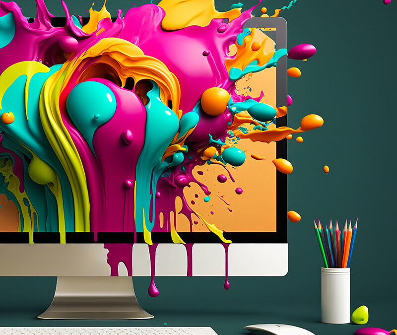
A smart and inspired graphic design is the key to your website’s success so we figured that taking a look into the world of graphic design trends of 2019 will help you find the best way to go for your site, design-wise.
One of the biggest website template trends for 2019 is using an unconventional color scheme, with really bold pallets. Web designers are gutsy and have no real fear of risking it when trying to create new and exciting web templates.
Fortunately, employing opposite colors and shades in order to create unexpected combinations and exciting contrasts is a gift that keeps on giving.
Designers use complementary colors to which they pull lighter or darker shades, depending on the case.
Using a contrasting background color is vital in order to obtain a high level of readability. Fashion has inspired web designers to choose a variety of unexpected colors to design their web projects and the results are great SEO-wise. Colors tend to attract visitors so keep this in mind when designing your future site.
Next, the Bauhaus style (Bauhaus comes from the school of thought that outlines the theory that form follows function).
More of an entire movement rather than just a web design trend, the Bauhaus design is responsible for influencing architecture and city planning to typefaces in the last century. It is so popular in web design because it gives a completely abstract look to any site. One of the most interesting graphic design trends 2019 had to offer so far!
The opposite of Minimalism, Maximalism, is one of the biggest template trends for 2019.
This trend is highly successful especially on social media, but web designers have long started to use details such as paint splotches, comic strip dots, brush strokes and highly vibrant textures that allow a whole world of possibilities.
Maximal web designers hate the idea that less is more and after applying color filters, expanding the text by dragging the corners or duplicating layers for a unique effect, they get the maximal look for any website out there.
Enabling Vintage looking fonts is also a trend that gets more and more web designers hooked, especially in 2019.
Used in the past mostly for tattoos or special event invitations, these fonts (Playfair, for example, or Abril Fafta), are some of the most used fonts by web designers who want to bring some more charm to a serious-looking website.
They are popular especially in short lines of text when the designer chooses to promote that classic, old-fashioned way of transmitting a clear message but in a charming way nonetheless. Playfair, for example, is mostly used for commercial/retail sites, while Abril Fafta can very well be used in media/communication-related websites.
Our trip in the world of the most popular graphic design trends for 2019 has lead us to the use of Negative Space to grab the attention of the visitors. Thanks to its unconventional use of empty space, this graphic design tool creates a sleek and modern look at the same time, with less effort than with any other style. Many product detailed websites were designed using Negative Space and, to be honest, they are as elegant as they come!
Maximalism tries to stand out in the crowd by filling empty space with content, while Negative Space is used along with all types of geometrical shapes or text bumping up or even overlapping with the frame.
These Negative Space tricks create an open, almost continuous, feel to the design, highly appreciated by web designers all over the world.

